Pastel shades perform several functions at once. First, they give a feeling of coolness, especially in a duet with a free flying silhouette. Secondly, such tones are perceived as more elegant, air, discreet. They can be said, harder than their bright fellow: there are more color nuances, they are multifaceted. Even with the title to decide, as a rule, more difficult: the color of the sea wave or mint? Phial or lavender? Pistachio or lime? ..
Compared to such a variety of smoky shades, familiar to us in the rest of the time, black, gray, brown look very hard, goded and, in general, most often inappropriate. Even it would seem mandatory for many "basic" black bag (no matter, it either from the suede or of the skin) is knocked out of summer images. You can, of course, try to "support" her, put on to become in the dark, but then you can literally melt into the sun as ice cream. And in all other combinations such a ridicul will become too contrasting the color stain, existing as described separately from the rest of the outfit. The same applies to too dark shoes.
There is another reason to choose in summer bright, broken colors: selected within the framework of a specific color, they beautifully shade the skin, both tanned and aristocratic white. So, what colors will suit the representatives of the "winter", "Spring", "summer" or "autumn"?
Basic rule: remember the color temperature.

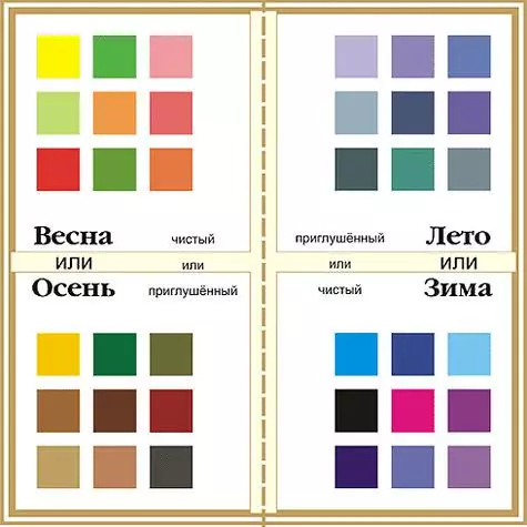
Table of coloring.
If your colorotype is warm ("spring", "autumn"), then the shades should be appropriate: peach, blood-milk, salmon, herbaceous, sand, warm light yellow, similar to a canine chickens. In the case when your appearance is cold ("winter", "summer"), you will fit: light lime, cold turquoise, lemon zest, cherry flowers shade, amethyst, iris.
In addition to the "Temperature", the color is and its brightness. For simplicity, you can say so: shades of spring and winter should be perceived brighter than summer and autumn. So, the "winter" light blue will be blinded-ice, like "winter" lilac, while in the "summer" tones will be read by grayish notes. And the "spring", for example, pink, will look more juicy than the autumn, which is rather inherent in such characteristics, like depth and muffled ...
I wish you this summer to find "your" beautiful colors from the gentle "dessert" palette and hit the surrounding freshness of the image!
If you have questions about style and image, waiting for them to mail: [email protected].
Katerina Khokhlova, Image Consultant and Life Coach
