Autumn - time mysterious and ambiguous. Someone in his soul, her romance and the silence of Alley with the rustling of fallen leaves under their feet, and for someone September - the signs of serness, cold, rain. In the autumn, we all start to zyabko wrapped in scarves and lack the sunlight. We remember summer sunsets and dawns and reluctantly get up on the alarm clock. It is not surprising that at this time, many seriously and for a long time go to faceless black and dirty dark gray to become quiet, merge with the world around the world, to go into themselves. However, it must be borne in mind that, as we have repeatedly discussed, the colors have a direct, direct and strong impact on our psychological state. So, picking up the day after day Dark depressive outfits, we risk and really fall into the despondency ...
The magic chalter for salvation from the autumn melancholy, as always, color therapy: wedge wedge embroodble. And since our task is with you, not only getting dressed, bright, impressive, but also in accordance with the trends of the fashion world, turn to the palette of the most relevant colors of autumn-2013. How to calculate them? The uninitiated can flip gloss and diligently write out recommendations on colors from it, we will go different ways - professional. On the eve of each season, an analytical selection of colors that meet the demands of the market and the public is published, which sets the tone of the collections of designers and reflects the color picture that we will soon see in stores. Recognized authority in this difficult business is Pantone. It is to their developments in search of inspiration specialists of the world of fashion and beauty, including me.

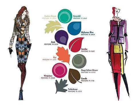
Palette colors, fashionable this fall.
So what is waiting for us this fall? The king of colors for 2013 is the emerald. He does not give up his position, so do not hurry to throw out or give things the shades of this gems. A juicy company will be a saturated berry red with the speaking name "Samba", as well as the color of Fuchsia is already almost classic. Heavenly blue is another "color vaccination" that will not allow Handing. From the Orange Palette, we will be interested in a luxurious tint - KoI, which is translated from Japanese means the shade of a brocade carp. Complete a juicy selection of bright purple - a tint of Akai plants.
Of course, no palette can consist of full of saturated "leading" colors: they must complement them and more relaxed shades, providing us with space for the preparation of beautiful combinations for different situations. This fall, the role of the background will be not black again, but much more interesting colors. Just imagine: the shade of the linden flowers, the color of the moss, the thunderstorm gray with the intriguing name "turbulence" and, finally, calm brown-greenish.
If you look at this selection of colors carefully, it is easy to see that there are shades that are suitable for each of the colorings. So, "winter" will suit the bright variation of the emerald, the color of Akai, Samba, Fuchsia. "Autumn" is brown-greenish, a tint of a brocade carp, a lime color, softened to sky-blue. "Summer" will be wonderful to look in Emerald, if you make it slightly "accomplished", in Fuchsia, if it is also a little "mute", the gray shade "turbulence", the color of MCH. And the "spring" will decorate the shrill skill-blue, the shade of the pary carp, the bright version of the Samba and the juicy version of the lime color.
All these colors can be combined, mix and use in their daily images: Then your mood will be rainbow, and the view - the blooming is not for the season! Let your autumn be bright!
If you have questions about style and image, waiting for them to mail: [email protected].
Katerina Khokhlova,
Image Consultant and Life Coach
